Yuna Mariel
- التعليق
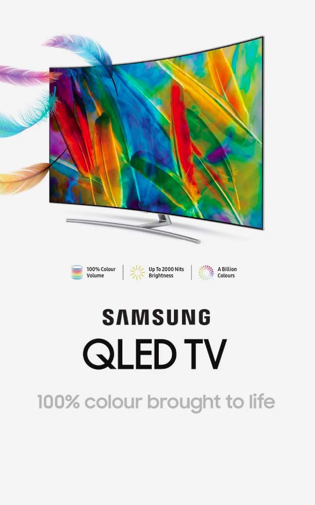
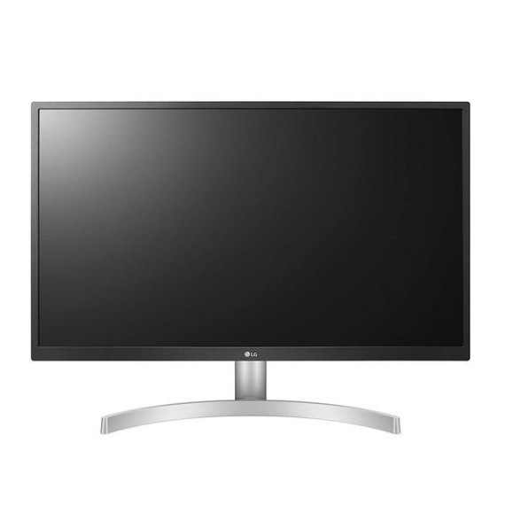
EDIT: After a month or so of use, I noticed the left half of the screen going dim, all the way from top to bottom. There was a brown patch at the very bottom of the screen. I touched it with my finger, and suddenly the entire half of the screen lit back up. In other words, the individual elements of the screen were coming apart. I practice good airflow and temperature management around my equipment, so its not like it got overheated or something. It simply... came apart. I stuck a thick piece of tape between the plastic casing at the bottom and the actual screen, simulating my finger keeping pressure on it, and lo and behold the screen was back to its bright ugly yellow glory. Like I said in my earlier review, this is a cheap IPS panel and youll never convince me otherwise. Its only good if youve never been exposed to really good professional stuff. I wound up using this monitor to read documents/Google stuff related to what Im doing, and for that its fine, but Id hate to see a game or artwork that someone made solely with this monitor. The colors would be so messed up, there are some displays even calibration cant fix. --- I know the common wisdom is that a monitor should cost around $300, but Ive always felt a monitor is an investment since your eyes are going to be looking at it all the time, so I usually spring for around $1500. For this monitor, I decided to try it even though it is a "cheap" model because its 2018 version, the "UK650" (instead of UL650) was voted #1 monitor of the year on many sites. (My other option was the Samsung QLED, which maxes out its brightness at 250 nits, which is insufficient for my work area. I got this mainly because of the IPS and the nits.) Unfortunately the UL650 has the same pitfalls as many cheap IPS panels: The grays are non-uniform and the white point is a little bit colourful (which it shouldnt be, it should be something that you can convince yourself is actually white). But the biggest nag is definitely that the grays and whites are DIFFERENT colours. If you look at it closely, at neutral default out-of-box settings (custom colour temperature, all colours at 50 points), white has a bit of a pinkish tint, but grays are yellow. They should all be the same colour temperature, but at this price range, monitors are known to do tricks to get as much performance as possible out of cheap subpixel materials. If you have low standards or just dont care, its not a big deal. But if you compare it side by side with a MacBook Pro (for example if youre using this product as a second monitor for your laptop) and go on a site like Amazon, you might notice the gray accents on the Amazon website look yellowish, and the orange "Add to Cart" buttons look rather more yellow than orange. I included a sample photo of the screen with an Adobe panel open and you can see that even though the background is supposed to be white and the boxes are supposed to be gray, there are definitely more yellows in the boxes than in the background. (Sorry for the rainbow trash in the picture, I just did a quick snap with autofocus on.) Again, its usually just a sign of a lower-priced IPS panel and you might not care. But if your house is filled with Macs and its a non-smoking house so your screens arent subtly yellowed over, youre gonna notice the difference. Yes, this screen distorts interfaces wildly, despite all the praise and acclaim.